large data display problem

Long forms cause frustration, the most infamous of which is when a user enters data and accidentally reloads the page, losing their progress. They also infamously intimidate users—and cause them to leave your webpage without finishing the form—because they look like they require a lot of effort to complete (and they do). While clever designers and writers can simplify forms somewhat by cutting unimportant fields, in many cases, long forms are essential and unavoidable.

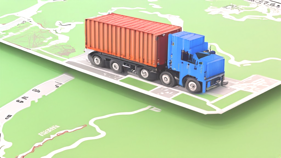
But in the logistics world, ocean shipments are infamous for their massive number of items and descriptions, which we can't avoid.
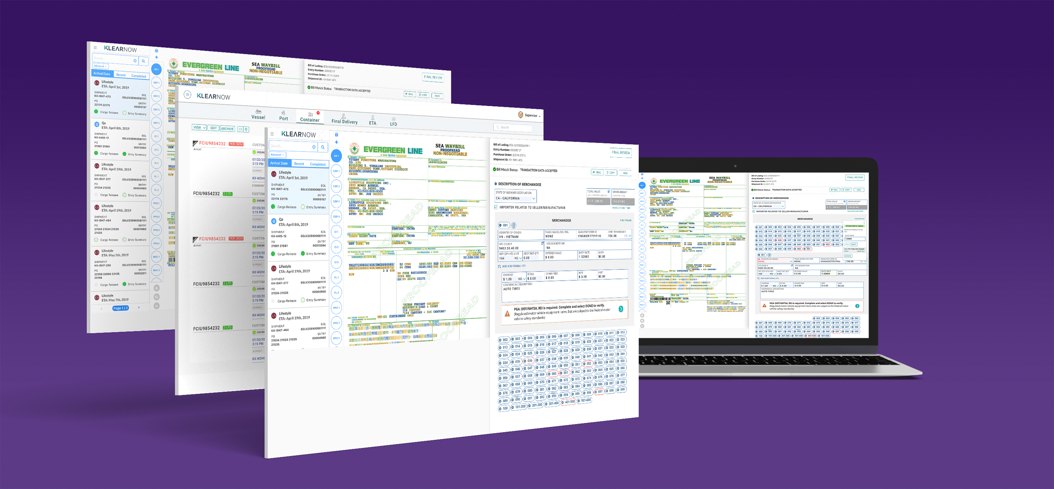
Also, there were other challenges. Based on the HTS code (Harmonized Tariff Schedule), a Partner Government Agency requires the importer to fill out additional paperwork alongside the Customs and Border Protection (CBP) that regulates commodities entering the U.S. Some PGAs include the Animal and Plant Health Inspection Service (APHIS), the Federal Drug Administration (FDA), the Environmental Protection Agency (EPA), etc.

Using this list of prioritized features, the big ideas from our sketches and the thinking from our original strategic vision, I worked closely with the product team to plan our sprints and build the entire high fidelity design specification.
Pain
point:
I called over 20 customs brokers to find their
pain and expectations.
Sticky note exercise:
Internally brainstorm with the product manager,
marketing, and engineering. Design a quick paper prototype and collect instant
feedback.
Design a high-fidelity static page to collect
external feedback.
Run many remote mini-usability tests
Constant iteration.
Finalize the design and push for engineering
'story'


interaction design
Expand collapse line items- the sense of
minimalism:
According to Jacob Neilsen, "They
simplify the page, lowering users' cognitive load and allowing them to
concentrate on the information immediately at hand."
Find and replace feature:
The Customs broker loves this feature,
which was revealed in one of our usability tests. It allows users to modify
data quickly.
Show useful information even when the form
is in a collapsed state:
Such as error, warning, PGA, or other vital
details help users quickly click on the correct line item and correct the
field.
Using micro animation:
Such as dissolve, blink, and fade in or
out, which are suitable for holding user attention.
long data in horizontal format

One of the most significant drawbacks of horizontal scrolling is that it can be jarring for some users, resulting in poor UX.

I have placed over 40 data columns without having horizontal scroll
When a project demands showing data more
like an MS-Excel-like column, how can we build an effective user experience
that still gives a sense of minimalism and clean data visibility? We may need
to compromise some sort of clutter, but what we learned about the users who are
dealing with 40-50 columns of data of over 1000 lines is that they are visually
trained to move around their eyes.
However, Excel can not provide a structured
data display with enhanced visual cues, powerful sort and search, and group
options, allowing users to access and edit the desirable data segment quickly,
and indeed, no AI tool can guide the most effective design.

selected projects
I am selecting eight projects out of over 70 enterprise applications with 20-plus years of design experience in various platforms such as desktop, mobile, TV, Hardware, etc.

SaaS app for Customs broker and Importer, track and trace
Executive leadership, Research and design

next-generation identity and access control policy platform
Executive leadership, Research and design